As I was developping this theme – my very first -, I discovered the WordPress team provides sample test data, together with a testing procedure which allows you to validate the basic features of the theme. It’s only one step in the process of testing but it’s necessary if you want to make sure your theme covers all the main functionalities. Well, after importing the data, I was in for a big surprise.
Over 40 categories were listed in my header ! Of course, this is only for testing purposes, you need to check they’re displayed without too much impact on your layout.
I don’t expect anybody to use that many categories, or even so, to actually feel like displaying that many in the header of the page. The theme options gives you the possibility to choose the ones you want displayed, probably the most important or interesting ones. But who knows what one might decide.
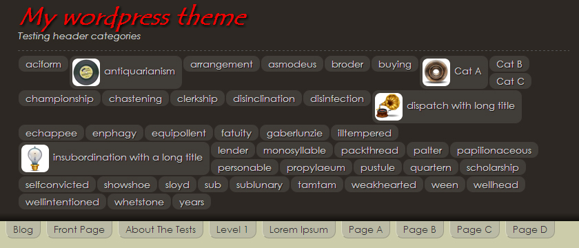
Just for the sake of testing the layout, I added thumbnails to some of them, I also extended the name of a couple, and the display ended up quite messy. I suppose it’s acceptable as it is though, and some basic CSS may give it a better appearance – by the way, I’m eager to learn a CSS trick that would get this perfectly aligned, if there is one. As first approximation, I gave all the elements a fixed width – say, 200px – I got something neat enough, although I ended up with a variety of heights because of line wrapping.
Well, I finally figured I could try some kind of packing algorithm to get this category list nicely aligned, considering the elements may have 2 possible heights, either they come with a thumbnail or not, and all kinds of widths depending on the actual size of the category name. Thus, I worked on the simple packing algorithm I exposed in the 2 previous posts.
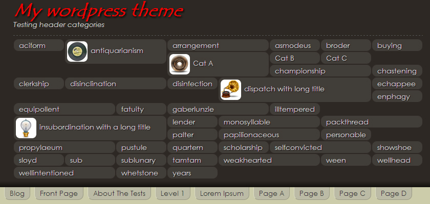
So here’s the practical application. And the first step is to set homogenuous sizes to all the elements, so that they align nicely. A little CSS fixed the height of elements with thumbnails to twice the height of those without. And for the widths, I went for a multiple of 100px, adding one line to my javascript file.
Some elements end up oversized after this operation. What can I say, it’s a question of compromise in the end I guess. I also tried multiples of 50px, but you get more possible sizes, and thus less chances the packing finds a neatly aligned solution.
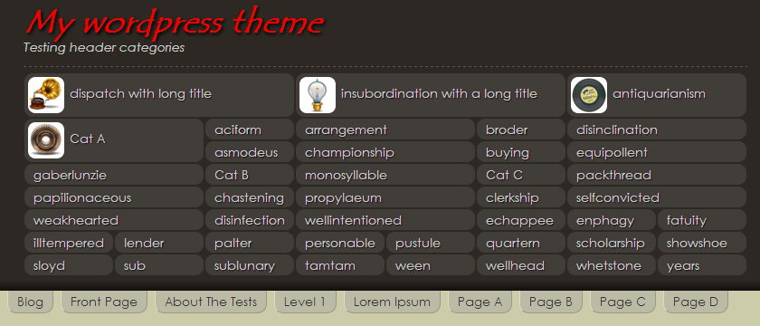
You’ll find details of the algorithm in the previous post. Applying it in this particular case is only a question of adaption. The boxes are <li> list elements instead of <div>, so I sometimes needed to add <ul> sub-containers. The global container is resized to the closest multiple of 100px, and that’s about all there is to it.
Take a look at the result, I’d say it’s pretty satisfying !


